Home Addition + Whole House Renovation
Expanding from inside out
That expression “the cobbler’s children have no shoes” applies across disciplines. Christiane, like so many professionals, had invested her expertise in client work while inadvertently neglecting her own home expansion. She and her husband, Mark, spent years dreaming about what their own Falls Church, Virginia mid-century modern home expansion could look like. When the time finally came, they were ready to go beyond the smaller renovations that occupied the previous years. Their family had expanded in that time, now including two children, and what they really needed was more space.
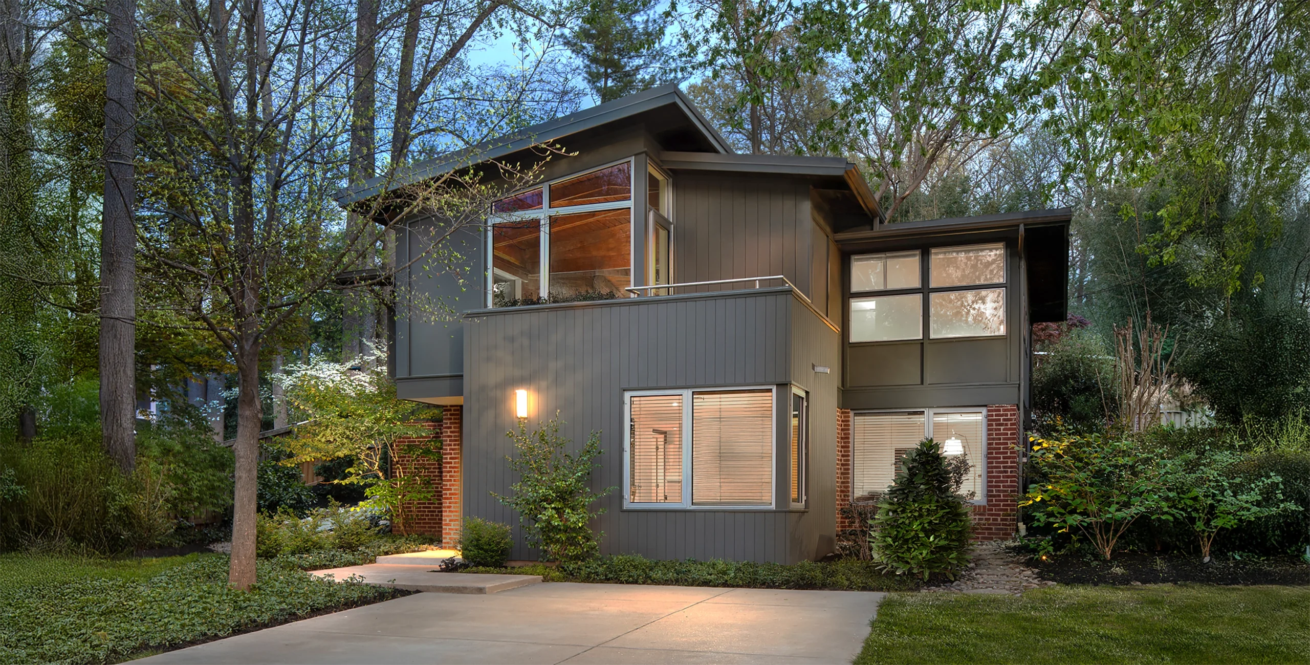
A front home expansion must carefully integrate with the existing facade. The solution lies in compatibly scaling and massing the new volume
Defining Opportunities for a Home Expansion
Like many deJong Studio clients, Mark and Christiane live in Holmes Run Acres, a wonderful northern Virginia, a mid-century modern community in Falls Church, Virginia designed by well-known architects Satterlee and Lethbridge. Over the years, Christiane had sketched out numerous options for a home expansion. Each iterative sketch was informed by a growing appreciation of the home’s original design. What they needed was enough space to keep the current home modestly competitive in today’s real estate market. This was a familiar challenge—one she’d been through with client after client. Christiane sought to add space and functionality while preserving and complementing the home’s original design.
A well designed addition enhances existing space while simultaneously offering expansion
Christiane and Mark wanted their two-story, three-bedroom home expanded to include a small fourth bedroom, a dining room, and a small master bath. While physically possible, this is a significant amount of space to add to an existing starter home. Looking at the setback criteria, it was apparent that a rear or side addition would not be permissible due to the local zoning criteria. This meant a front addition was the only option. This would require a thoughtful design and Christiane spent copious hours exploring ways to minimize the bulk of the new space.
Developing the Design
With a front addition, the challenge lie in developing a design that would not eclipse the original house. The answer became clear. Keep the volume tight to the original house and minimize bulk by creating a composition of smaller volumes. Christiane saw the deep front yard as an additional opportunity. As she progressed through the design process she continually considered multiple distanced vantage points from the street.
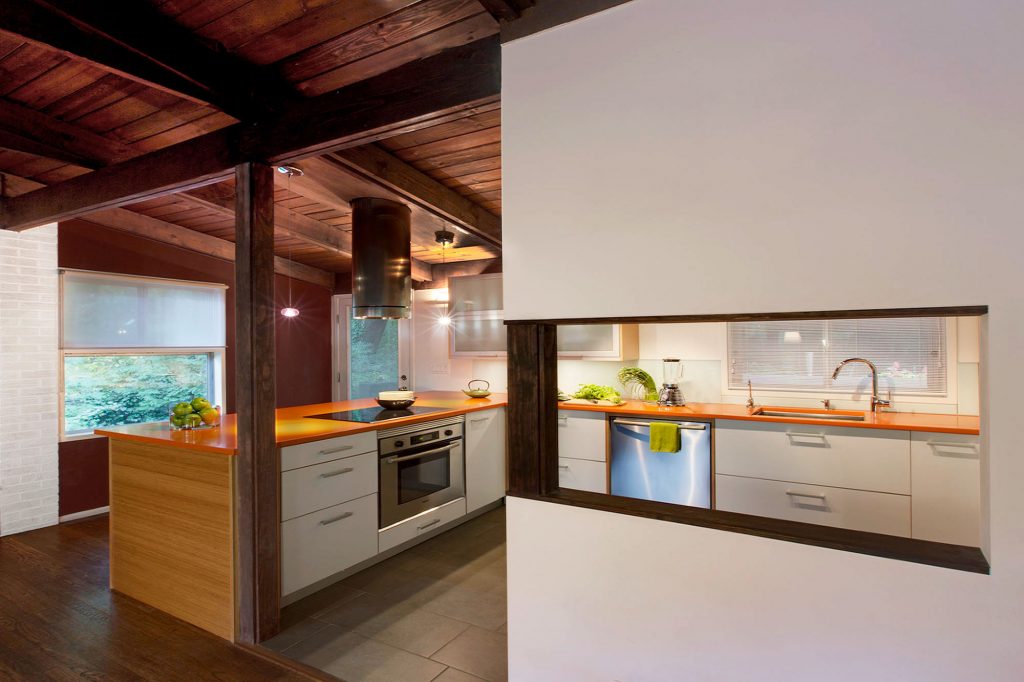
A partially open kitchen offers more controlled views. An eat-in counter, Spanish baltic plywood cabinets, bamboo end panels and orange Caesarstone countertops offer a retro modern palette
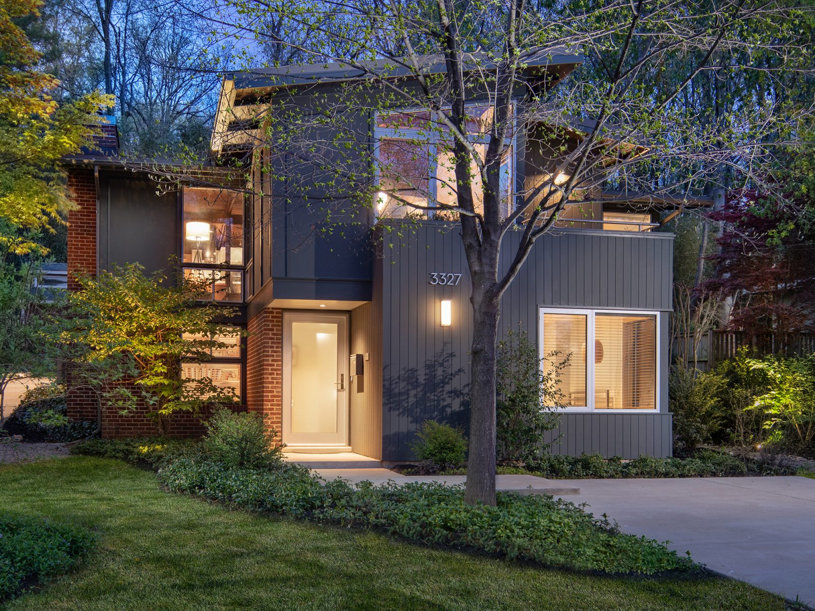
Christiane and Mark are passionate aficionados of mid-century modern design. At the same time, they knew they wanted the design of the addition to stand out in its own right. They found certain components of the original design to be lacking. They wanted a covered entry, an entry foyer, and a way to greet arriving guests from the upper-level living room. Christiane was confident these could be integrated using compatible modern staples not part of the original design. Elements like a cantilevered volume, a small roof deck and new aluminum windows would stand apart and yet continue to honor the mid-century modern lexicon.
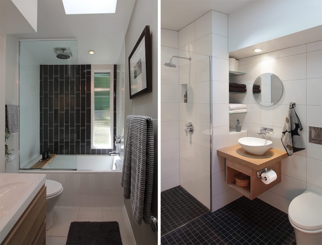
Even small baths can provide big luxury when well designed. Frameless glass splash guards and curbless shower provide an elegant simplicity
Living the Dream
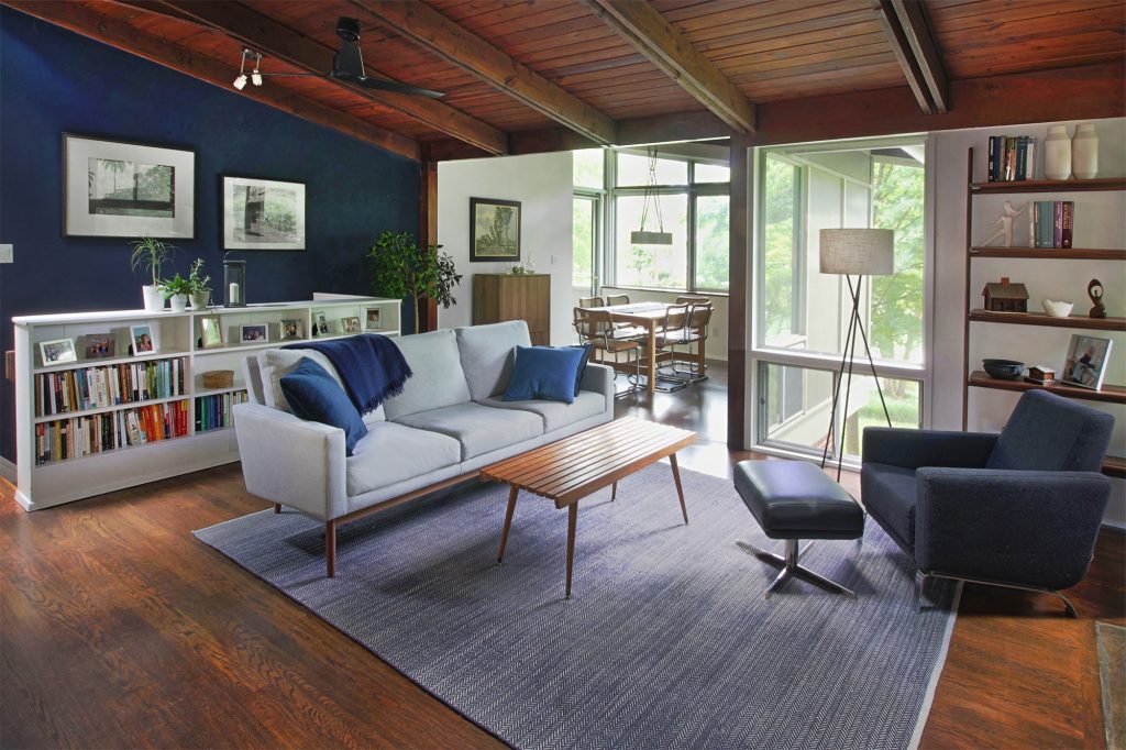
After months of construction, much of it self-built, Christiane and Mark were rewarded with a highly efficient 400 square-foot addition. The addition proved to be a game-changer for the deJong family. It offered much needed room for growth and also shifted the perceived center of the house forward toward the street in the expansion. The living room, once fine for family but too small for entertaining, now took on the character of a wide-open loft space. The high-sloped dining room space and adjacent balcony remediated the former sense of confinement and separation between inside and out. The small master bath supplied privacy for the primary bedroom. The cantilever over the front door and foyer vastly improved the home’s entry and a visitor’s first impression. At last, the completion of construction represented the culmination of years of thoughtful effort. The family could not be happier with the roomy results of their Falls Church, Virginia home expansion.